Step by step: Build a simple navigation bar with pure HTML and CSS (desktop)
Table of Contents
The final product #
This post is a step-by-step on how to build a navigation bar. If you would like to see the final product along with the code then just open this open up the sections. As the navigation bar isn’t reactive, it won’t show well on mobile.
It doesn’t look great on dark themes so make sure to switch to the light theme!
Navigation Bar (desktop)
HTML
<body>
    <nav>
        <ul class="navbar">
            <li class="nav-left"><a href="">Home</a></li>
            <li><a href="">About Us</a></li>
            <li><a href="">Our Products</a></li>
            <li><a href="">Contact Us</a></li>
        </ul>
    </nav>
</body>
CSS
@import url(
    '<https://fonts.googleapis.com/css2?family=Lato:wght@300&display=swap>'
    );

body {
    font-family: 'Lato', sans-serif;
}

.navbar {
    list-style: none;
    display: flex;
    background-color: #113946;
    padding: 1em 1em;
}

.navbar a {
    color: #FFF2D8;
    text-decoration: none;
    font-size: 1.2em;
}

.navbar a:hover {
    color: #EAD7BB
}

.navbar li+li {
    margin-left: 1em;
}

.nav-left {
    margin-right: auto
}
Step 1: Create a list #
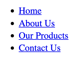
Whenever I create navigation bars, I like to use the nav tag. As it’s a semantic tag it’s good for SEO and accessability. The unordered list comes in handy as it communicates to developers (and yourself!) that the links are part of one group.
| |
And this is what it looks like…
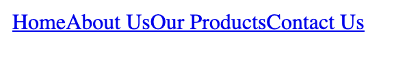
Stage 2: Make it horizontal #
Okay, so let’s make it look a bit better. First of all we want to get rid of all the bullet points. Then we’ll make navigation bar display content horizontally. Finally, we’ll add a touch of paint and add some colours. Add the following CSS to your stylesheet:
| |
Changing the display to flex displays turns .navbar into a flex container. This allows us to use flexbox to help with laying out our navigation bar.
Stage 3: Space things out #
Okay so things look a bit smooshed together and the whole thing could do with some nicer padding. Add the following code to smooth things out a bit:
.navbar {
    list-style: none;
    display: flex;
    padding: 1em 1em;
}

.navbar li+li {
    margin-left: 1em;
}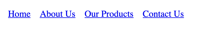
It’s coming together now! Now most navigation bars these days leave the home link on the far left with the other links on the far right.
In order to create this effect I will give the home li item its own CSS class so that we can manipulate it directly.
<nav>
    <ul class="navbar">
        <li class="nav-left"><a href="">Home</a></li>
        <li><a href="">About Us</a></li>
        <li><a href="">Our Products</a></li>
        <li><a href="">Contact Us</a></li>
    </ul>
</nav>
Finally, set the right margin of the nav-left class to auto.
.navbar {
    list-style: none;
    display: flex;
    padding: 1em 1em;
}

.navbar li+li {
    margin-left: 1em;
}

.nav-left {
    margin-right: auto;
}
Setting margin-right to auto means that the browser automatically changes the right margin such that it pushes everything else to the far left. Every time you resize the window the right margin changes so that everything can fit on the screen.
Stage 5: Add some colour #
A good touch of colour and a nice font goes a long way. I used color hunt to autogenerate a nice looking palette within seconds.
The background colour of the navigation bar needs to contrast really well the font colour. This is so the links are easily visible.
Add the highlighted sections to your stylesheet and choose a palette you like:
.navbar {
    list-style: none;
    display: flex;
    background-color: #113946;
    padding: 1em 1em;
}

.navbar a {
    color: #FFF2D8
}

.navbar a:hover {
    color: #EAD7BB
}

.navbar li+li {
    margin-left: 1em;
}

.nav-left {
    margin-right: auto
}
Adding a hover colour is a nice way to show the user that links are clickable.

Stage 6: Change the font to something nicer #
Finally, I’ll import a nice, professional looking font. Google fonts is a great source of free and great looking fonts. I settled on Lato and applied it to the body tag. I set the text-decoration of the anchor tags to none in order to remove the underline. The underlining crowds the navigation bar and makes the text harder to read.
@import url(
    '<https://fonts.googleapis.com/css2?family=Lato:wght@300&display=swap>'
    );

body {
    font-family: 'Lato', sans-serif;
}

.navbar {
    list-style: none;
    display: flex;
    background-color: #113946;
    padding: 1em 1em;
}

.navbar a {
    color: #FFF2D8;
    text-decoration: none;
}

.navbar a:hover {
    color: #EAD7BB
}

.navbar li+li {
    margin-left: 1em;
}

.nav-left {
    margin-right: auto
}
It’s looking good but the links are a touch too small for my liking. I think 1.2em would be a good font-size.

Looks nice and professional!
@import url(
    '<https://fonts.googleapis.com/css2?family=Lato:wght@300&display=swap>'
    );

body {
    font-family: 'Lato', sans-serif;
}

.navbar {
    list-style: none;
    display: flex;
    background-color: #113946;
    padding: 1em 1em;
}

.navbar a {
    color: #FFF2D8;
    text-decoration: none;
    font-size: 1.2em;
}

.navbar a:hover {
    color: #EAD7BB
}

.navbar li+li {
    margin-left: 1em;
}

.nav-left {
    margin-right: auto
}
Congratulations on your new navigation bar! 🎉 #
And there you have it! A nice, professional looking navigation bar built purely with HTML and CSS. Once you build enough of these you’ll be able to whip these up pretty quickly and customize it the way you want.